I’ve had the decorators in: new look to website plus accessibility improvements
After many years, I’ve bitten the bullet and made some changes to this website. Some of these are cosmetic and may not be noticed, but there are many underlying changes to the infrastructure including a lot of small, but notable, accessibility improvements.
Regular visitors to this blog — which is probably just me — might notice that things have changed a little bit. I’ve taken some time over the last week to update the look and feel of my site.
Outwardly, it’s not a very bold change. This website still consists of three pages, with the blog page as the main page that includes summaries of each post. I’ve ditched the ‘Read More’ links as each blog post title is also a link.
The most obvious visual change is that I have refreshed the look of the site and doubled down on red as an accent colour.
However, there are many more changes that have happened _behind_ the scenes, including many accessibility improvements.
Squarespace upgrade
The main reason I made any changes to the site is that this website has been running on Squarespace v7.0 for many years. The latest version of Squarespace is v7.1; while this might not sound very different, it’s quite a fundamental change.
Upgrading to 7.1 is a non-reversible action and after I made the change, it immediately changed how my site looked (for the worse). Squarespace 7.1 just does a lot of things differently and some of the things you could do in 7.0 just don’t exist any more.
I have spent many hours just making very small refinements to get the site broadly looking like it used to. Although this was a bit of a time sink, it made sense given that the charity site I manage (careif.org) and the site I built for my artist friend (meganyelets.com) are both running Squarespace, so it makes sense for all of these sites to be running on the same version.
Accessibility updates
One of the things I really wanted to do with this refresh is improve the accessibility of this site. This follows a lot of work I’ve been doing in my main job to help improve the accessibility of the RCPsych website.
This means that this website now includes:
Improvements to hover states: you’ll see a yellow background when hovering over a link, the link text will darken and the underline will thicken.
Improvements to focus states: keyboard users can tab through elements and see a black box border on links.
Use of ‘active’ state: clicking on a link slightly darkens the yellow background colour to reinforce that a link has been clicked.
Making use of visited link status: if you click on a link, then your browser will remember this and change the link colour to grey. This is not so much of an accessibility improvement, but could potentially help people with memory problems, providing a clearer indication of what they have previously clicked on.
Incidentally, removing all of the ‘Read More’ links on my blog landing page is another accessibility improvement. Link text should be unique on a page, as someone using a screen-reading device would otherwise struggle to distinguish between different link destinations if they all say the same thing.
These are the sorts of improvements that can take a bit of time to implement, but it’s a one-off investment that provides lasting benefits. You will never know which users of your website have disability requirements, so making it as accessible as possible removes barriers that prevent some users from benefiting from content.
Rekindling the joy of building a website
A short tale of how I unexpectedly ended up creating a website for an artist friend.
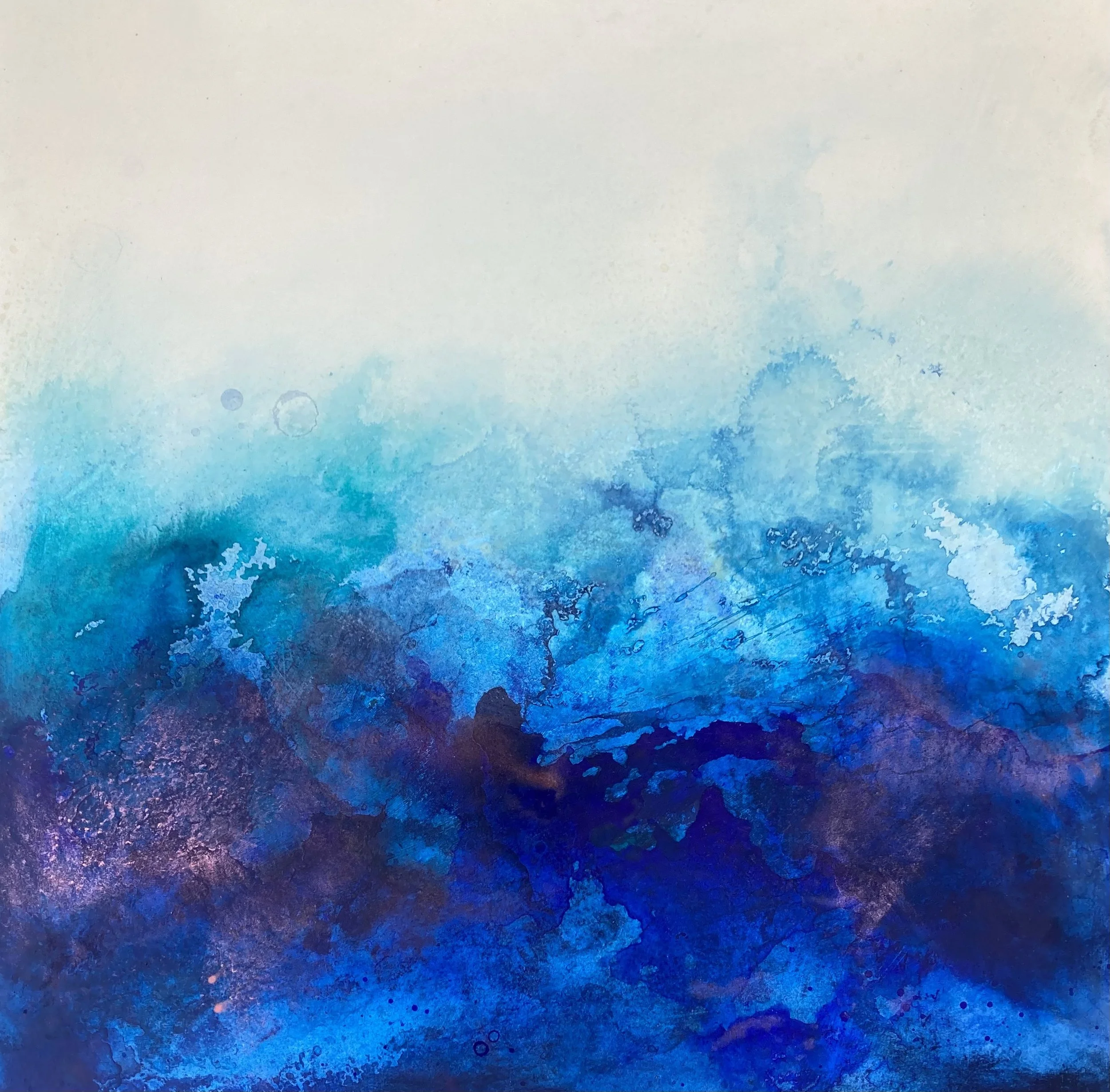
Art by Megan Yelets
Last Thursday I was waiting to see my 8-year old’s school play and was chatting to a parent friend who was standing in the line next to us.
She is a great artist who is currently showing her work at an exhibition in London, but she revealed that she didn’t have a website or own her own .com domain.
A couple of hours after the play ended I bought her domain name for her. I also offered - if she wanted - to build her a website for free.
I have quite a bit of experience using Squarespace to build websites (including this site) and I felt like this might be the sort of thing where a built-in template would probably meet most of her requirements without much need for tweaking.
We met the next day to discuss what options were available and less than a week later her website — meganyelets.com — is now live (built to her specifications)!
Building a site for an artist
This is a very different type of project compared to anything else I have done in my years of managing and building websites. After we had reviewed some other artist’s websites, Megan had requested that she wanted a big cover image on the home page that would lead into a gallery of some of her images.
It quickly became apparent to me that we needed the whole focus to be on the art itself. Consequently this led me to keep everything else relatively plain and unobtrusive.
I probably had the first draft of the site all complete with a couple of hours. I then spent many more hours doing lots of fine tweaking.
Frustratingly, I discovered that although Squarespace lets you add custom code and CSS while you are building the site (i.e. while you are effectively on a free plan) but as soon as the site goes live, your custom code will be removed if you are on their base level plan.
I only realised this after the site went live and so I then had to find a workaround as I didn’t think it was worth a £60 per year upgrade to the plan just to get this one extra feature.
Next steps
Megan is very happy with the results and I hope that she now has a platform to help showcase her lovely art to a wider audience.
As for me, there is still some work to be done and I hope to set her up with a newsletter service so she can more easily share updates with people interested in her work.
Building a better digital future: three major changes that I helped make at the ICR

ICR logo in Lego by Keith Bradnam
After four and a half years as the Digital Strategy Manager at the The Institute of Cancer Research (ICR), I am moving on to pastures new. My new role — at The Royal College of Psychiatrists — will probably feature in some future blog posts, but for now I wanted to reflect on my time at the ICR.
In particular I want to look back at three broad areas which have seen some notable changes while I have been at the helm of the ICR’s Digital Team. For some of these I also want to provide some explanation as to why things needed to change.
I’d like to extend my thanks to the amazing members of the Digital Team that I have worked with over the last few years, including several wonderful interns. They have all helped implement many of the changes that I talk about in this post.
1. Changes to editorial content
We have made lots of small changes to how our news items, blog posts, and feature articles have appeared. These mostly include adding more things to each article:
- Hero images at the top of all editorial content
- Crossheads in editorial content
- Promo blocks (in-article indented sections to promote other parts of the website)
- Hyperlinks to external sources (particularly for clinical trial information)
- Tags
This can clearly be illustrated by comparing a typical recent news post with one from 2015. The goal of these changes was to make the content richer, more useful, and more engaging.
The last item on the list above — consistently tagging content — has enabled the development of dynamically updated landing pages for specific cancer types or research themes, e.g. brain cancer and genomics. This means that the small act of tagging content as we go, means we can aggregate content in different ways at a later date.
Another important change for our editorial content is that we applied to have it treated as a source of news by Google. This resulted in ICR stories not only showing up prominently in Google News, but also they can sometimes be included in the main Google search results for relevant queries:
Google search results for ‘cancer drugs’ in May 2019…showing news story on ICR website as second item in ‘Top stories’ section
This change led to a significant increase in traffic to the website from Google and is probably one of the biggest changes from the last few years that has hopefully attracted new users to the website.
2. Collecting more analytics data
We now have comparative data points for almost 1,200 pieces of editorial content. This has been achieved by logging how many page views each news item, blog post, or feature article has received in the first seven days it has been up on the website. We also have categorised each piece of content in a systematic way (e.g. research news items vs institutional announcement news item vs cancer awareness month blog post etc.)
This has produced a rich resource which has been able to quantify how our content has improved over time (as well as tracking how our output has changed over time). The categorisation has also enabled us clearly compare the success/failure of content in a like-for-like manner (e.g. policy-related stories can be compared to other policy-related stories).
If you don’t have a way of quantifying whether your content is good or bad, then it is very hard to make meaningful changes without being able to measure the influence of those changes.
Internal and external social media metrics
For social media, I developed an internal metric to measure the monthly performance of our social media posts on Facebook, LinkedIn, Twitter, and Instagram. This metric ends up being a very large number which mostly captures the reach of our posts but also factors in engagement on social media platforms.
This involves calculating the reach of all posts on each platform in any given month, and then increasing that number by the engagement rate of posts on that platform (there’s a few other things going on as well but this describes the essence of it).
The real utility of developing metrics like this is in being able to look at trends over long time periods.
This internal metric was complemented by registering the ICR to be tracked by EduRank, an independent social media benchmarking service for Higher Education Institutions (HEIs).
It was pleasing to see that my internal metric related well to our monthly EduRank ranking. It has also been pleasing to see that as a smaller HEI — with very few students — we typically ranked in the top 25% of the more than 200 HEIs tracked by EduRank.
3. New ways of reaching audiences
We launched an Instagram channel in late 2016, which has now grown to have almost 2,500 followers. This platform was subsequently recognised in 2019 as being one of the top ten cancer centres on Instagram.
We also launched an Apple News channel, making the ICR one of of only two cancer research organisations to have a presence on this platform (or at least as far as I can tell…the other one is the Dana-Farber Cancer Institute).
Doing more with our existing platforms
On our existing social media platforms we have embraced the use of infographics and I have occasionally tried making short animations to try to succinctly explain some details of our big news stories. Here is one of my favourite ones about an artificial intelligence approach that tries to predict how cancers might evolve.
We flirted with using Storify for a time to collate together all of our social media — and the resulting media coverage — around our big news stories. Storify is no more but Twitter Moments has been a good substitute (a recent Moment looked at how ICR staff were coping with working at home).
We have also launched a series of email newsletters providing another route to share news and updates from the ICR.
One final innovation that I will highlight here is the change to creating short videos with ICR scientists at conferences. Modern smart phones can produce completely acceptable video quality, especially for use on social media. If you add a cheap (as little as £10) lapel mic, you can record suitable quality audio too.
I have recorded several of these videos at conferences and have always been able to edit them (just using iMovie on my iPhone) and then publish them to social media on the same day they were filmed. E.g. here is the ICR’s Professor Ros Eeles captured at the NCRI 2019 conference last year.
On the topic of the NCRI conference, I’m insanely proud for spotting the opportunity to have some fun with the big #NCRI hashtag sign that was set up during the conference. Couldn't miss this opportunity for some ICR branding!

#NCRI becomes #ICR
The evolving digital landscape
It’s been an exciting time at the ICR and hopefully some of the changes that I have helped introduce will continue to have a positive influence for a while longer. However, the nature of digital platforms is that things are always in flux.
An approach that works well today may become irrelevant in a year’s time. There will be new social media platforms in future and existing ones will continue to evolve. Legal frameworks — such as those that relate to GDPR and accessibility — are also drivers of change across the digital landscape and organisations have to be responsive to changes in the law.
It feels hard to know exactly how we will all be using websites and other digital platforms in the near future. It is safe to say though, that things will be different and I very much look forward to finding out what lies ahead!
Frustrating web design #1: AT&T
Earlier today I was trying to see whether the pre-paid phone plan that my inlaws are using during their visit here would allow them to send texts to the UK. A quick trip to a page on AT&T's website almost, but not quite, revealed the necessary information.
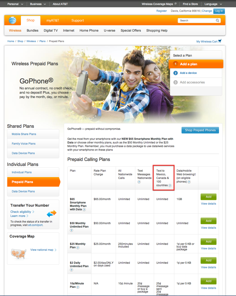
The box highlighed in red says Text to Mexico, Canada & 100 countries. In order to find out what those other 100 countries are, I tried mousing over the question mark symbol. This short video shows what happened next:
That's lovely AT&T, make me have to copy a URL by hand and type it in. Because the web is much more efficient that way.