
Davis Forever: The blog I never told anyone about (until now)
As I review lots of my past websites and blogs, it’s time to reveal one of the more unusual sites that I set up. I once secretly ran a blog under a made-up name, writing about strange goings-on in Davis, California. Here's a confession about it that I've never made before.
I’ve been slowly trying to catalogue all of the websites and blogs that I have ever been involved with. This led me to a recent blog post where I looked back at the first ever website that I made.
Now it is time to reveal the details of a blog that I once created, which I kept entirely secret from anyone.
Davis Forever
When I was living in Davis, California, I decided to create a blog (‘Davis Forever’) that commented on strange goings-on that happened in the city. This was a TypePad-hosted blog that was accessible at davisforever.com (a domain I owned at the time). For about a year, the blog posted various anecdotes about unusual things happening in Davis.
None of it was real though. I just made everything up. This is the first time I have admitted to this ruse.

I also had a Twitter account at the time to promote the blog and this was used to comment on other things happening in Davis. The blog’s author was ‘CJ’ and I purchased this stock photography image to use as the ‘face’ of the blog.
Even though the blog has long since disappeared, thanks to archive.org I’ve been able to recover the posts, and I’ve included my three favourite posts below. I’m not altogether sure as to why I created this blog. It was a lot of effort to put together for a site which almost no-one noticed. Apologies to anyone who was taken in by any of these (hopefully harmless) posts.
Favourite Davis Forever blog posts
The Traffic Lights Turn Blue Tomorrow
Posted by CJ on May 28, 2009 at 10:38 PM
Some people reading this will perhaps think I am referring to lyrics from the classic Jimi Hendrix song, The Wind Cries Mary. But no. This is a blog about Davis, California remember? The place where toads get tunnels built for them to help them cross the road, the place where crazy things can - and do - happen.
Well the latest wacky idea comes from Mr Hector P. Schulz of Antioch Drive, Davis. He has suggested to the town council that Davis should honor the forthcoming Independence Day celebrations in a particularly novel way. His suggestion is that all traffic lights in Davis should have a custom color makeover just for July 4th. And of course he wants those colors to be red, white, and blue. The following image is the picture that he created to show how this might look.
<image no longer available>
It seems though that he didn't provide any explanation as to how this would be done or the potential costs that would be involved. It might be a fun idea to try, crazy and potentially dangerous, but fun nevertheless. I somehow think that this is one far out idea that our beloved council will not embrace, though you never know...!
Think you know Davis... what about Davis, Illinois?
Posted by CJ on June 03, 2009 at 09:58 PM
Despite my occasional mocking of some of the peculiar decisions that sometimes are made in this town, I still love Davis and I'm thoroughly enjoying living here. Until today, if someone mentioned 'Davis' then there is only one place that I would think of. That is no longer the case. You probably don't know but our great country is blessed by three other places called Davis (in Oklahoma, West Virginia and Illinois). If we also consider the original name of Davis (which was Davisville) then there are also name-sake towns in Texas, Missouri, Alabama, Kentucky, and Rhode Island. Furthermore, if we extend our search to include 'Davis City' then there is also a place of that name in Iowa.
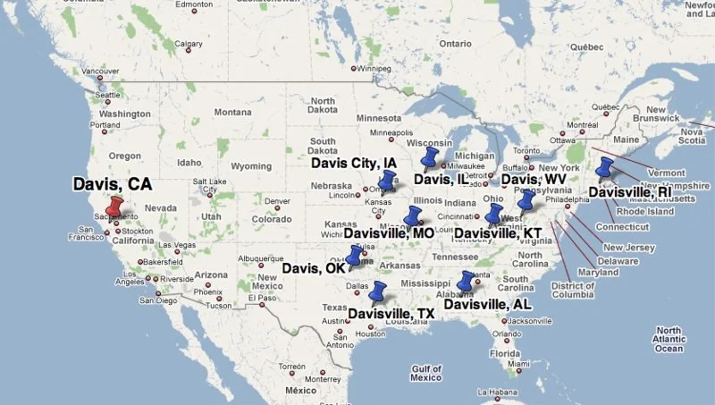
So why does it matter that our town is not unique (at least with respect to its name... it certainly is unique in many other ways)? Well, one of our fellow Davisites thinks that we should settle the question of which Davis is the best Davis by way of staging an inter-Davis contest. The plan (which is only tentative at the moment, but will possibly be submitted to the city council in the coming weeks) would be to invite representatives from our name-sake locations to Davis and challenge them at a number of events. Each Davis(-ville, City) would choose their own event, so I'm guessing that any event that we (Davis, California) nominated would surely feature cycling. Anyone have any ideas for what events we would be good at? I'm sure that if this actually goes ahead, then this would be the sort of competition where crazy events would probably be more suitable (how about a tree-hugging contest?).
I'm not sure if it would be entirely fair to do this all on home turf, but then if events had to be staged at every different location then that's going to get a bit complex to organize (and expensive too). Actually, I think there was some discussion that if this was successful, it could become an annual feature and each year would take place in a different Davis. Now I'm sure that all of the other Davis's, Davisvilles, and Davis Cities are very pleasant places to live, so I'm not sure if we want to risk creating rivalries by claiming that any one Davis is better than any other. However, I guess this could be a lot of fun and probably would be good publicity for Davis. I've said it before, and I'll say it again: I love Davis... all of them!
A Davis Conversation
Posted by CJ on June 20, 2009 at 05:05 PM
This blog post deals with something unusual which happened to me (normally I only hear about these things from other people). Earlier this week I was walking down E St, about to grab an iced-coffee from Peet's when a car pulled over next to me.
The driver, a man in his mid- to late-fifties, proceeded to ask me whether I lived in Davis and whether I could help him with directions. Now as a loyal citizen of this great, little town, I was only too happy to oblige him. After all, shouldn't we all offer a warm welcome to any outsider who happens to be visiting Davis. The rest of the conversation went something like this:
Him: So I'm looking for the Davis Walmart store.
Me: Ah, I don't think there is a Walmart in Davis Sir.
Him: You kidding me?
Me: No, I'm pretty sure about this Sir. It's a small town and I've lived here a while now. Was there something specific you were looking for, maybe another store in town might have what you want.
Him: I was looking for a Walmart... the Davis Walmart.
At this point he seemed to be getting a little uptight. I proceeded as best I could.
Me: I'm really sorry, but there isn't a Walmart in Davis. We have an Ace hardware and homeware store, we almost have a Target store, but we really don't have a Walmart.
Him: So you're calling Ernie a liar?
Me: Umm, who's Ernie?
Him: My cousin. He's the one that told me about the Davis Walmart.
Me: Oh I see. And Ernie lives in Davis?
Him: No. In Ohio. So where's the Walmart then? Ernie wouldn't lie to me.
By this point I was half tempted to just walk away. But I tried staying calm and proceeded to help him.
Me: Sir, maybe your cousin was referring to the Walmart in Sacramento, or the Walmart in Dixon, or the Walmart in Woodland. They are all pretty close to Davis, just 15 minutes drive east, west, or north of here.
Him: Look miss, I am not talking about any of these other so-called Walmarts. I'm talking about the Davis Walmart. I need to get to the Davis Walmart, now would you please tell me where it is?
Me (exasperated by this point): Sir, I can't do that... because there really is no Walmart in Davis, I don't know how else I can say this. But if you like, I can show you how to get to one of the other...
Him: Forget it! I always thought this town looked like the sort of place where no-one would stop to help someone. You're the third idiot now who's refused to tell me where you are hiding the Walmart. If you won't tell me where it is, I'll just drive around until I find it. I ain't no quitter!
And that was that. He drove off, last seen heading north on E St. A very rude man, in search of the mysterious lost Walmart of Davis. Maybe this is some sort of underground campaign by Walmart to get a store opened here. They'll keep sending people here who are trying to find it in the hope that the city caves in and builds the store for them.
By 'eck, it's worse than Barnsley: my first website (from 1997)
Back in 1997, building a website meant typing HTML by hand. My first website was called 'By 'eck, it's worse than Barnsley’ and this post takes a nostalgic look at how this website came to be. I also discuss some of the features of websites built in the 1990s (web counters and guest books).
I started my PhD in late 1996, at a time when creating a website was a very rare thing to do. For instance, this was around the same time that the BBC had only just launched their own website (and they were ahead of many other organisations).
There was no Squarespace or Wix at this time and websites were nearly all created by writing HTML by hand into a text editor. I was already a little aware of the nature of websites because during my Masters degree (in bioinformatics) someone’s final MSc project was simply to build a single webpage of bioinformatics links. It seems laughable now that this could be a project suitable for a Masters degree, but it really was a new frontier at the time requiring skills that most people just didn’t have.
Version 1
Because my PhD was in a technical field (Computational Biology) and because I shared a computer lab with colleagues who had already tinkered with creating their own webpage, it was a natural step for me to have a go at it.
So in early 1997, I started building my first ever website which I called “By ‘eck, it’s worse than Barnsley”. This was a subtle reference to an obscure short film which remains one of the greatest pieces of televisual work ever filmed.
This is the oldest version of my website that I could find on archive.org (captured October 1997):
Click to enlarge
A classic 1990s element of this website is the web counter (showing 7,088 hits on this visit). I’m not quite sure why I wanted to be so apologetic with the subheading (‘I’m really very sorry’), but that was what I went with.
The very first (and short-lived) version of this site — not captured by archive.org — featured a NASA moon image as the background. This loaded perfectly fine for me, when sitting at a computer that was in the same room as our web server, but I subsequently discovered that the page would take minutes to completely load for anyone else not on the same local network.
The website was built by typing HTML into a text file. That was about all you could do in 1997! Over time I learnt about techniques such as iFrames which let me have a fixed left-hand navigation menu and then load the content of each link into an iFrame on the right-hand side. This meant that the URL of the site never changed.
Over time, I found new pages to add to the sidebar including an early Perl-script generated page that highlighted the ‘Top 40’ pages on the web server. This was something you could do quite easily when the web server was running on the same computer that you logged into to do your work. Apache’s web server software would create an ever-growing access_log file which was perfect fodder to be mined with a Perl script.
During the first year or two of my PhD, the server hosted a few webpages from other PhD students and a very rudimentary lab website. In time, I used it to build a website for the band that I was in (‘Bring me sunshine - home of the Sunflowers’) as well as a website for the Department of Genetics (in which our lab was based).
Version 2
I changed the look of the website at some point in 1998 or 1999 and ended up with the following design (although this capture is from February 2007, the site was effectively unchanged for many years):
Click to enlarge
The web counter had been removed by this point, but my site’s name stayed the same. I had also stopped using iFrames so that each page could be accessed on its own URL. The main structure of this page is an HTML table.
The ‘arrow’ (six dots and a > character) below the word ‘Barnsley’ was an animated GIF that I had made (click the archive.org link above to see it in action). I can’t remember what tool I would have used to make an animated GIF at this time…there wouldn’t have been a lot of easy tools to use. I created the UK map image by digitally tracking around an existing map as I recall. Clicking the map would take you to a page I made with information about Barnsley.
The last modified date on the above screengrab indicates that the page had effectively been unchanged for over four years. This was because I had finished my PhD and was on my third post-PhD job by this point. It’s kind of crazy that I still had login access to the server from my PhD.
I made one subsequent change to this site to really flag that this site was no longer active and the last capture of the site by archive.org is on February 2008, so that’s a good 10-year run for my first website!
Thinking back to this site, I have fond memories of the sheer fun of building a website at that time. I like how I had settled on a clean, white background aesthetic, which has sort of become my go-to style for most websites that I’ve created since then.
Search traffic is collapsing, direct traffic is booming: here's my data
Website analytics are getting harder to trust: AI search summaries are cutting overall traffic, while AI apps and tools are increasingly showing up in the vague "direct" bucket instead of being properly attributed. Using real data from three sites over 2024–2026, this post shows search traffic share collapsing and direct traffic share surging, and I conclude by asking what this all means for anyone trying to understand how their website is actually being used.
Love it or hate it, AI is having a big impact on the world. If you are involved in managing a website, you probably have noticed the indirect effect of AI in your website analytics data. One obvious way that this manifests itself is in declining levels of overall traffic.
Tools like Google’s AI search summaries are obliterating traffic for many websites as people find all the information they need without needing to click through (and that’s assuming that there is even a link to click on). A Pew Research Center study from last July found that users were much less likely to click on links when their Google search results had an AI summary compared to search results without one.
Direct traffic
In a blog post from January, I wrote about the different ‘buckets’ of traffic that website analytics platforms record. This includes obvious things like ‘social media’ and ‘search engine’ traffic, but also the broader (and somewhat nebulous) category of ‘direct’ traffic. Historically, this was really referring to people who went directly to your website by using browser bookmarks, clicking on links in emails, or even just by typing a web address.
Direct traffic is effectively any traffic that cannot be put into any of the other buckets. My earlier post focused on the subset of direct traffic which has been referred to as ‘dark social’. This will include people who click on links in messaging apps like WhatsApp…these apps don’t leave any digital fingerprints so the data is recorded as ‘direct’.
AI traffic
However, traffic from AI tools is increasingly showing up in the ‘direct’ bucket too, and this is something that has been capturing a lot of attention recently, e.g. see:
The AI Traffic Attribution Crisis: Why Your Analytics Are Wrong (Updated With Real Data) - November 2025
The 70% Problem: Your AI Traffic Is Hiding in GA4 Direct - June 2026
Your AI Traffic Is Hiding: A Practical Guide to Tracking ChatGPT, Claude, and More - June 2026
Even though analytics platforms like Matomo are trying to now identify AI traffic, it’s not easy and people like me who spend a lot of time looking at website data, are finding it harder to get a clear picture of how websites are being used.
Here is some actual data from three websites that I manage. The chart below shows the percentage of traffic that is recorded as search engine or direct at three different time periods (the first six months of 2024, 2025, and 2026). The websites are anonymised.
Click to enlarge
In all three cases, these websites have seen a big decline in the share of traffic coming from search engines and a corresponding big rise in the share of direct traffic. I’m only focusing on the share of traffic from different sources rather than the total level of traffic.
It’s possible that this rise in direct traffic has nothing to do with AI…but that’s the problem with direct traffic, it’s all unknowable.
If this change is largely driven by AI (which seems reasonable) then it means that the future of managing a website is going to be a very different experience. We might expect to see declining levels of overall traffic. We might also expect to see that the vast majority of traffic is direct traffic.
The quality of your traffic is going to matter much more than quantity but identifying high-quality vs low-quality traffic is another challenge altogether.
2,000 links and one new colour
For World Refugee Day, I helped launch CARE — a new resource archive on the Careif charity website linking to over 2,000 external resources on refugee mental health. Building it within the existing Squarespace site surfaced some real limitations, particularly around page hierarchy and folder structure, and prompted a new accent colour to distinguish the section. With the launch done, there's still work ahead on rethinking the content model and staying on top of link rot — but for now, I think I've earned a summer break.
It was recently World Refugee Day (20 June) and for much of the last six months I have been racing to help launch a new website project for the Careif charity where I volunteer my time.
We chose 20 June as our target launch date for CARE - the Careif Archive of Refugee Empowerment. CARE is a collection of resources relating to the mental health of refugees and asylum seekers aimed at both professionals working in these areas as well as those directly affected and in need of help. You can read more about it in the launch news story which I wrote.
I’ve been helping build these pages at Careif since last year. There is a lot of content (it brings together links to over 2,000 external resources) and it means that the number of pages at Careif has effectively tripled.
Building the site
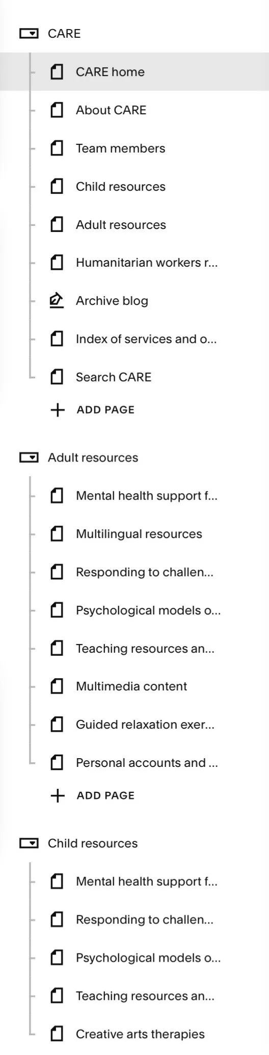
Squarespace page folders
Although there were some talks about whether this might be a completely separate website to Careif, we decided to build it as part of the site.
That has led to a few challenges in working with the Squarespace CMS. Although Squarespace lets you arrange pages in folders, you can only have one level of hierarchy. The new CARE pages predominantly concern adult resources and child resources, but there are also other sections (e.g. resources for humanitarian workers).
I can create URLs for all of these pages that reflect this hierarchy, e.g.
careif.org/care/adult-resources
careif.org/care/child-resources
careif.org/care/humanitarian-resources
However, Squarespace doesn’t let you recreate that hierarchy visually in the CMS. This is because, although you can create folders to help arrange pages, they can only be one level deep (I think the primary purpose of folders is to arrange pages that will appear in navigation menus). This may seem a minor point but I think it points to the challenges of using Squarespace if you are going to develop a big website.
So I ended up having to create three separate folders to make it easier to manage these pages, with one folder each for adult and child resources and another folder for everything else.
A new colour
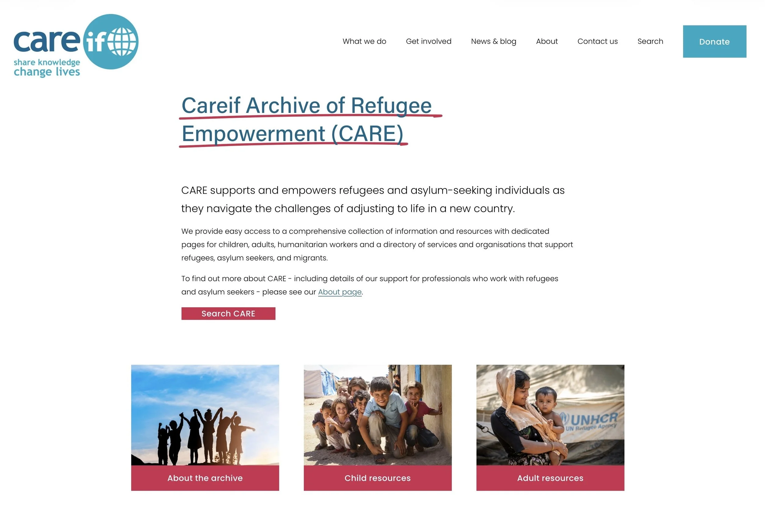
When building the ‘new’ Careif website a few years ago, I had settled on a very simple colour palette which was based on the (pre-existing) Careif logo. As the CARE pages have greatly expanded the Careif site, I felt like we needed one new colour to be used on CARE pages which was distinct from the existing colours but which still complemented them.
Using one of the many online colour palette tools that you can find (I used the excellent coolors), I settled on ‘raspberry’ as the CARE accent colour. This is applied as an underline on page titles and also as a new secondary button colour.
Rethinking the content model
There is still work to be done in creating one more page of resources for CARE. In putting these pages together, I feel that ultimately all of the page content should be completely rebuilt as some form of database with all resources tagged/categorised appropriately.
One possible solution for this in Squarespace would be to create every individual resource as its own blog post (with relevant tags/categories applied) and then use a third-party plugin to have a front-end that lets you search and filter all blog posts.
This would be a lot of work but could make managing the content easier as there would only be one content item (a blog post) for each resource, whereas currently some individual resources are duplicated across different pages.
Tackling link rot
Now that the site has grown so much, an additional challenge is to be better at checking for ‘link rot’. With over 2,000 links to external sites, we can expect those links to break regularly as sites shut down, get merged with other organisations, or just rearrange all of their content. This is a common challenge with managing any site that links to a lot of external material.
At RCPsych we use Dr Link Check to find broken links (there are various paid plans available) and I think we will try using this at Careif too now.
Time for a break
This has been a lot of work to get the CARE pages together and it is pleasing to see that they are already generating traffic. For me personally, this is now the third big piece of web development I’ve done outside of work this year. I’ve built an artist’s website for a friend (meganyelets.com), I’ve rebuilt this website and now I’ve helped launch CARE. I think I have earned a summer break now!
I’ve had the decorators in: new look to website plus accessibility improvements
After many years, I’ve bitten the bullet and made some changes to this website. Some of these are cosmetic and may not be noticed, but there are many underlying changes to the infrastructure including a lot of small, but notable, accessibility improvements.
Regular visitors to this blog — which is probably just me — might notice that things have changed a little bit. I’ve taken some time over the last week to update the look and feel of my site.
Outwardly, it’s not a very bold change. This website still consists of three pages, with the blog page as the main page that includes summaries of each post. I’ve ditched the ‘Read More’ links as each blog post title is also a link.
The most obvious visual change is that I have refreshed the look of the site and doubled down on red as an accent colour.
However, there are many more changes that have happened _behind_ the scenes, including many accessibility improvements.
Squarespace upgrade
The main reason I made any changes to the site is that this website has been running on Squarespace v7.0 for many years. The latest version of Squarespace is v7.1; while this might not sound very different, it’s quite a fundamental change.
Upgrading to 7.1 is a non-reversible action and after I made the change, it immediately changed how my site looked (for the worse). Squarespace 7.1 just does a lot of things differently and some of the things you could do in 7.0 just don’t exist any more.
I have spent many hours just making very small refinements to get the site broadly looking like it used to. Although this was a bit of a time sink, it made sense given that the charity site I manage (careif.org) and the site I built for my artist friend (meganyelets.com) are both running Squarespace, so it makes sense for all of these sites to be running on the same version.
Accessibility updates
One of the things I really wanted to do with this refresh is improve the accessibility of this site. This follows a lot of work I’ve been doing in my main job to help improve the accessibility of the RCPsych website.
This means that this website now includes:
Improvements to hover states: you’ll see a yellow background when hovering over a link, the link text will darken and the underline will thicken.
Improvements to focus states: keyboard users can tab through elements and see a black box border on links.
Use of ‘active’ state: clicking on a link slightly darkens the yellow background colour to reinforce that a link has been clicked.
Making use of visited link status: if you click on a link, then your browser will remember this and change the link colour to grey. This is not so much of an accessibility improvement, but could potentially help people with memory problems, providing a clearer indication of what they have previously clicked on.
Incidentally, removing all of the ‘Read More’ links on my blog landing page is another accessibility improvement. Link text should be unique on a page, as someone using a screen-reading device would otherwise struggle to distinguish between different link destinations if they all say the same thing.
These are the sorts of improvements that can take a bit of time to implement, but it’s a one-off investment that provides lasting benefits. You will never know which users of your website have disability requirements, so making it as accessible as possible removes barriers that prevent some users from benefiting from content.
Rekindling the joy of building a website
A short tale of how I unexpectedly ended up creating a website for an artist friend.

Art by Megan Yelets
Last Thursday I was waiting to see my 8-year old’s school play and was chatting to a parent friend who was standing in the line next to us.
She is a great artist who is currently showing her work at an exhibition in London, but she revealed that she didn’t have a website or own her own .com domain.
A couple of hours after the play ended I bought her domain name for her. I also offered - if she wanted - to build her a website for free.
I have quite a bit of experience using Squarespace to build websites (including this site) and I felt like this might be the sort of thing where a built-in template would probably meet most of her requirements without much need for tweaking.
We met the next day to discuss what options were available and less than a week later her website — meganyelets.com — is now live (built to her specifications)!
Building a site for an artist
This is a very different type of project compared to anything else I have done in my years of managing and building websites. After we had reviewed some other artist’s websites, Megan had requested that she wanted a big cover image on the home page that would lead into a gallery of some of her images.
It quickly became apparent to me that we needed the whole focus to be on the art itself. Consequently this led me to keep everything else relatively plain and unobtrusive.
I probably had the first draft of the site all complete with a couple of hours. I then spent many more hours doing lots of fine tweaking.
Frustratingly, I discovered that although Squarespace lets you add custom code and CSS while you are building the site (i.e. while you are effectively on a free plan) but as soon as the site goes live, your custom code will be removed if you are on their base level plan.
I only realised this after the site went live and so I then had to find a workaround as I didn’t think it was worth a £60 per year upgrade to the plan just to get this one extra feature.
Next steps
Megan is very happy with the results and I hope that she now has a platform to help showcase her lovely art to a wider audience.
As for me, there is still some work to be done and I hope to set her up with a newsletter service so she can more easily share updates with people interested in her work.