I’ve had the decorators in: new look to website plus accessibility improvements
After many years, I’ve bitten the bullet and made some changes to this website. Some of these are cosmetic and may not be noticed, but there are many underlying changes to the infrastructure including a lot of small, but notable, accessibility improvements.
Regular visitors to this blog — which is probably just me — might notice that things have changed a little bit. I’ve taken some time over the last week to update the look and feel of my site.
Outwardly, it’s not a very bold change. This website still consists of three pages, with the blog page as the main page that includes summaries of each post. I’ve ditched the ‘Read More’ links as each blog post title is also a link.
The most obvious visual change is that I have refreshed the look of the site and doubled down on red as an accent colour.
However, there are many more changes that have happened _behind_ the scenes, including many accessibility improvements.
Squarespace upgrade
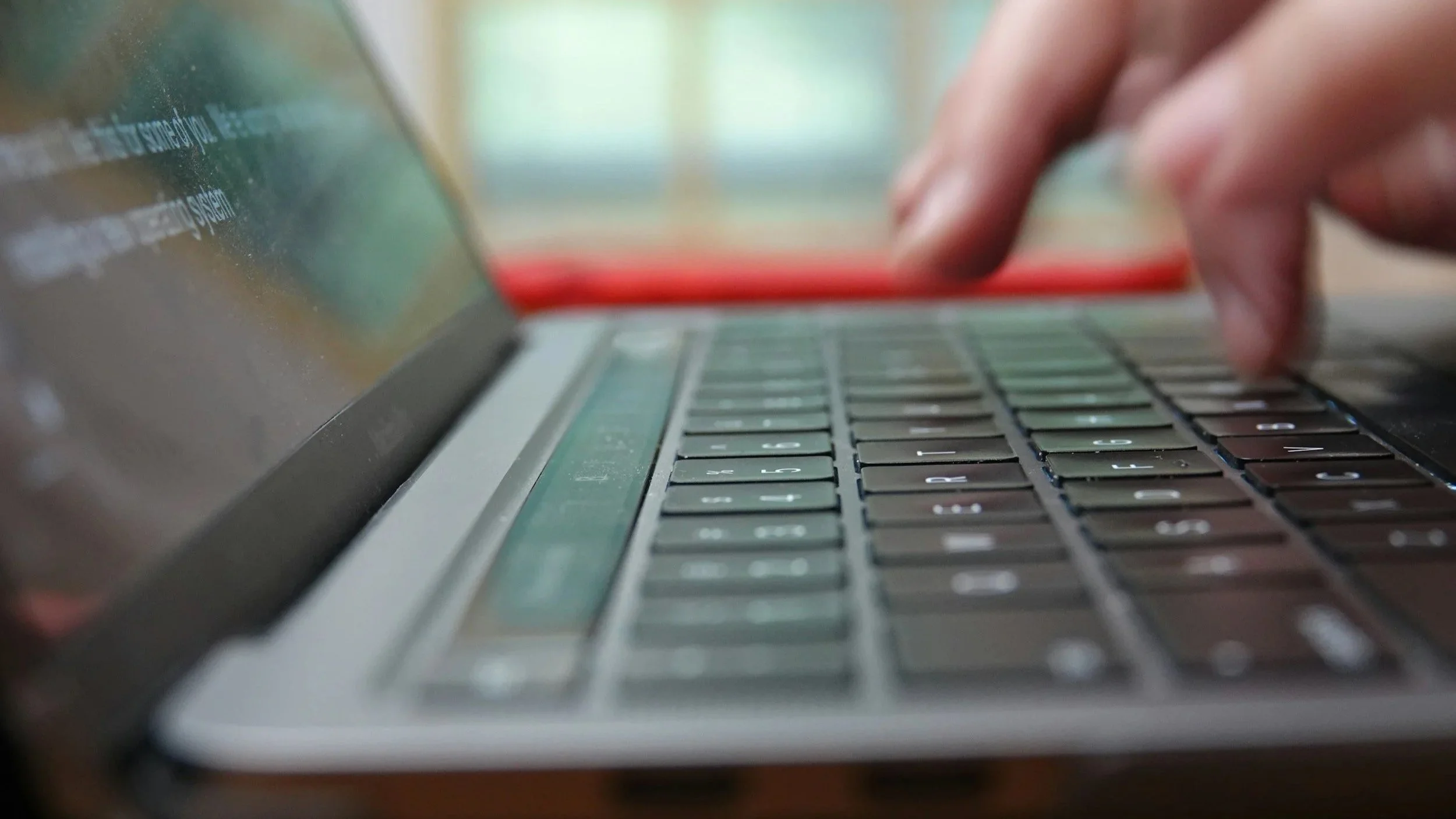
The main reason I made any changes to the site is that this website has been running on Squarespace v7.0 for many years. The latest version of Squarespace is v7.1; while this might not sound very different, it’s quite a fundamental change.
Upgrading to 7.1 is a non-reversible action and after I made the change, it immediately changed how my site looked (for the worse). Squarespace 7.1 just does a lot of things differently and some of the things you could do in 7.0 just don’t exist any more.
I have spent many hours just making very small refinements to get the site broadly looking like it used to. Although this was a bit of a time sink, it made sense given that the charity site I manage (careif.org) and the site I built for my artist friend (meganyelets.com) are both running Squarespace, so it makes sense for all of these sites to be running on the same version.
Accessibility updates
One of the things I really wanted to do with this refresh is improve the accessibility of this site. This follows a lot of work I’ve been doing in my main job to help improve the accessibility of the RCPsych website.
This means that this website now includes:
Improvements to hover states: you’ll see a yellow background when hovering over a link, the link text will darken and the underline will thicken.
Improvements to focus states: keyboard users can tab through elements and see a black box border on links.
Use of ‘active’ state: clicking on a link slightly darkens the yellow background colour to reinforce that a link has been clicked.
Making use of visited link status: if you click on a link, then your browser will remember this and change the link colour to grey. This is not so much of an accessibility improvement, but could potentially help people with memory problems, providing a clearer indication of what they have previously clicked on.
Incidentally, removing all of the ‘Read More’ links on my blog landing page is another accessibility improvement. Link text should be unique on a page, as someone using a screen-reading device would otherwise struggle to distinguish between different link destinations if they all say the same thing.
These are the sorts of improvements that can take a bit of time to implement, but it’s a one-off investment that provides lasting benefits. You will never know which users of your website have disability requirements, so making it as accessible as possible removes barriers that prevent some users from benefiting from content.